From your phone
bank whenever you want, wherever you are
Case study
A personal project exploring how Eurobank’s homepage and navigation could help visitors find relevant banking services.
Independent concept project, not affiliated with Eurobank.
Interactive preview
Open Products, explore the page, or scroll through the design.
Desktop homepage and navigation concept.
01 · Problem
Eurobank’s homepage gives considerable space to promotions, while its navigation makes it difficult to see what each section contains. With too many messages competing for attention, the main action was easy to miss.
02 · Research
I reviewed the homepage and navigation using Nielsen’s usability heuristics and principles from Krug and Norman. I then compared how other banks organise their services.
App-store reviews helped me understand customers’ wider concerns, although they were not direct evidence about the website. Published usability research helped me assess patterns such as rotating promotions.
Together, the findings pointed to two priorities: making the navigation easier to explore and organising the homepage around what visitors need to do.
Rotating homepage promotions
Promotional cards competing for attention
Products presented through tabs and a carousel
Repeated links in the original footer
03 · Design
Each part of the redesign needed a specific job. The navigation needed to show what it contained, while the homepage needed a stronger focus and a way to explore services by need.
Opening Products shows the available services without taking visitors to another page. Familiar categories such as Accounts and Loans appear with short descriptions explaining what each option is for.
Log in and New customer remain visible as direct starting points for existing and prospective customers.
Services visible inside the open Products menu
I replaced the rotating promotions with one message and one New customer button. The message and button are aimed at people who are still deciding whether Eurobank is right for them. Existing customers can still log in from the navigation.
One message and one action for new customers
Interactive preview
Select New customer to preview the button interaction.
Choose how you bank. You can change your mind later.
Homepage hero concept.
Someone may know what they need without knowing the name of a banking product. The “What brings you here?” section begins with familiar situations, then shows relevant options beside them.
Banking services organised around visitors’ needs
Interactive preview
Choose a need to explore the options.
STEP 1 — PICK A NEED
Pick the closest one. You can change it at any point.
Not sure where to start?
STEP 2 — CHOOSE AN ACCOUNT
An account is where money lands and leaves. Some pay interest while you can still reach the money, and some hold it for a fixed time.
Concept preview. Other destinations are not included.
The section presents two ways to open an account: through the app or at a branch. A shared three-step overview shows what getting started involves before visitors choose how to begin.
App and branch routes presented side by side
Interactive preview
Explore the two ways to get started.
Use one, or both. You can change at any time.
bank whenever you want, wherever you are
talk to someone in person who can help you
WHY START HERE
Whichever way you start, it is the same three steps, and you can see all of them before you begin.
Concept preview. Other destinations are not included.
I removed product links that were already available through the main navigation. The footer keeps company information, rates and fees, support, and legal links where visitors expect to find them.
Support, company and legal information in the footer
Interactive preview
Explore the footer links.
Concept preview. Other destinations are not included.
04 · Mobile
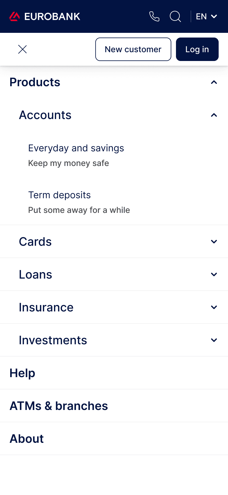
On mobile, the navigation moves into an expandable menu and the homepage sections stack vertically. The routes and priorities remain the same, but the layout fits the smaller screen.
Interactive preview
Open the menu, explore Products, or scroll through the page.
Choose how you bank. You can change your mind later.
STEP 1 — PICK A NEED
Pick the closest one. You can change it at any point.
Not sure where to start?
STEP 2 — CHOOSE AN ACCOUNT
An account is where money lands and leaves. Some pay interest while you can still reach the money, and some hold it for a fixed time.
Use one, or both. You can change at any time.
bank whenever you want, wherever you are
talk to someone in person who can help you
WHY START HERE
Whichever way you start, it is the same three steps, and you can see all of them before you begin.
Mobile homepage and navigation concept.
The complete mobile homepage

The mobile menu with Products open
05 · Outcome
The final concept gives promotions less prominence and introduces two ways to explore Eurobank’s services: by product or by need. The homepage and navigation follow the same structure across desktop and mobile.
The design has not yet been tested with participants. My next step would be to ask people to find a suitable account and locate how to become a customer, then observe where they hesitate. Those sessions would show me what needs to change.